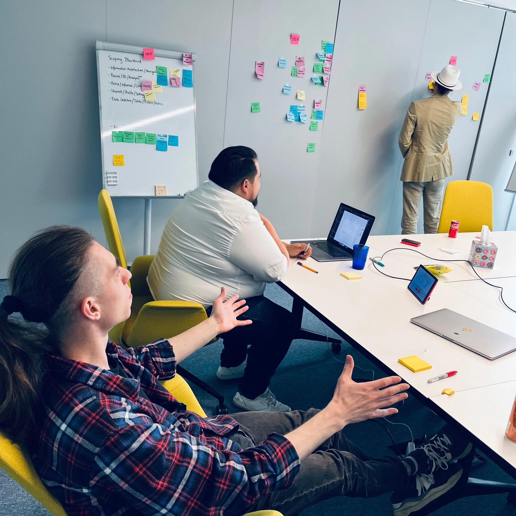
Implementing filter features was harder than it sounded.
-
The interface had limited filters in place, alowing users to only search using "and"
-
Interaction Design involving a bit of UX
-
Extending filter editing options required more space and extra functionalities
-
Drag-n-drop filter interaction applied by users
FLYR's filters were initially limited to a string of requirements. However, the interface demanded more flexibility. It required options like "and" functionality and grouped filters. Implementing these features necessitated significant changes. We meticulously tested and refined numerous iterations, ultimately creating a highly effective environment.

Phase 1: Analysis
Phase 1I: Design
Adding a few functionalities resets the full design.
Moving from having filters connected by "and" to the option to also choose "or" and "not" sounded simple but had far more implications than expected. The new setup required the ability to group filters, which made the designers realize that users would also need to edit the order of the items. Additionally, two states were necessary: an applied state, displaying the results, and an editing state, where the filters are temporarily disconnected from the results while being edited. Another consideration was where to place new filters in a fully edited setup: should they go at the start or the end?
First attempt: failed.
Initially, we planned to position this functionality on the right, in the same section where the user selects the filters. The idea was that users would select and set up the filters, see the results in the top bar, and view the search results in the table below the filter string.

The rich level of interaction didn't fit in a vertical space. It gets overly complicated, as you can tell from the image.
Since the section on the right is vertical, the search "string" had to be vertical too, to fit in. However, editing something meant to be read as a phrase was not intuitive in a vertical layout. It became messy and overly complicated – this approach was not effective.
Essential to this approach is the concept of seeing it as an "advanced" option. From an information architecture standpoint, we should've known this was the wrong way. To the user, "advanced" or "more" or "other" will never be intuitive. So where does it make sense to position this functionality?

Back to the concept
Try seeing it like this. The filter section on the right is the shop, you select which filters to use. To eventually apply. Once you've chosen which filters to use, you get to edit those. As a collection. Like in a cart. So the editing is kept separate from the choosing. This also added the benefit the editing could be done in horizontal mode.

Second attempt: separate "selecting" from "editing".

So we positioned the editing to the top of the table. With the filters you selected applied, you're looking at the search results. If you want different results, you pick new filters. If you want to drill down, you edit the ones you chose.
Result
Through various feedback loops at the end-user's side, we learned they succesfully used the feature. There were a few edge-cases we hadn't taken into account but were able to fix once we heard of them. The new situation felt as if it had always been like this.